1- To-do App in Blue
-1.webp)
Our first example is, of course, a to-do app, a classic example of learning applied for the first time by both designers and developers.
The interface encourages focus and has a modern feel with bright blue tones on a crisp white background.
The card-based list layout and clean symbology allow the user to view and interact with tasks quickly and easily.
2- Sending Money App
-1.webp)
In our second example, the designer has created a clean card layout.
And with plenty of white space, the content is highlighted and the user is spared from unnecessary visual clutter.
The blue hue used feels like a vibrant and saturated cobalt blue (around #3366FF) and keeps the contrast sharp on both the action buttons and the top info bar.
The text is in a modern sans-serif font (probably SF Pro or Inter), which creates hierarchy with different weights and provides high readability across long texts.
4- Real Life Example: Skyscanner
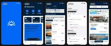
Skyscanner as the 4th application we reviewed in our blog post. With real app examples that have proven their worth, it will give you clearer examples in blue apps.
On the main screen, it lists flight, hotel and car rental options in the top menu and offers price and route information with a card layout at the bottom.
The blue tones both reinforce Skyscanner's brand association and create a sense of confidence and definition in the menu bar, featuring buttons and highlights, separating the sections.
This vibrant blue is used consistently throughout the app, providing visual guidance to the user.
Examples of great interface design used in real life provide much clearer insights because those layouts have been tested by real users.
5- OpenSea App Blues
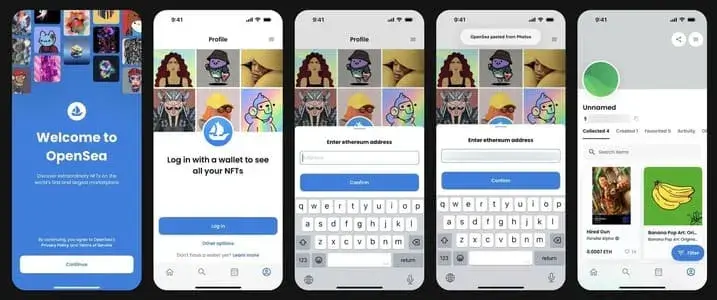
OpenSea, the fifth and first crypto app on our blog, starts with a vibrant blue splash screen and wallet address entry, allowing you to easily view the NFT portfolio.
The saturated blue hue makes the brand identity powerful and consistent. The card layout of the NFT listings is straightforward and legible.
Although NFTs may seem to have lost their golden days, considering their point of inspiration, it is possible for them to make a comeback.
6- Coursera
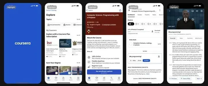
Coursera's card-based interface has a consistent hierarchy of course listings, filters and video player modules.
It is probably one of the first apps to use blue as the primary color. Founded in 2012, it is a pioneer in the democratic distribution of knowledge.
As a platform focused on learning, the selected saturated with blue hue evokes a sense of confidence and accomplishment.
With streamlined navigation and clear calls to action, users can quickly access the content they want and follow their lessons.
7- The Weather Channel
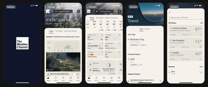
The Weather Channel's deep navy blue (#002E5D) feel offers both a serious and peaceful atmosphere. The blue hue pairs well with the grayscale backgrounds used in the mapping panels, highlighting seasonal changes and real-time alerts.
With minute-by-minute rain updates and a travel module, the app reassures users by keeping them informed about any weather situation at any time.
8- Venmo
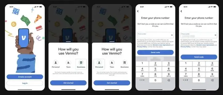
Venmo's design language is humorous, with hand-drawn illustrations and rounded buttons.
Smooth transitions between functions simplify the user experience by making sending and requesting money fast. The bright Venmo blue chosen (#3D95FF) conveys a sense of reliability and vibrancy.
9- Visible
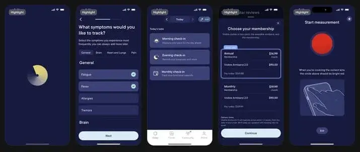
Visible is another app that uses dark lavender in its brand identity. This color choice reinforces the seriousness and reliability of the chronic disease tracking app. It also represents the depth of humanity by using a deep color.
Components such as selecting symptoms, diary and community tabs guide the user step by step in a modular structure. By integration of health data analysis and mobile measurement tools, symptom tracking is facilitated both visually and functionally.
10- Wolt

Wolt, a startup founded in Helsinki in 2014, has rapidly expanded restaurant and grocery delivery. The light pastel blue background is elegantly matched with vibrant photo cards and bold text. The Explore tab, promotion slider and filter menu allow the user to intuitively find the flavor they want.