This article examines the Microsoft Color Palette and the effects of colors on our minds. We will also look at a palette inspired by Microsoft's design guidelines.
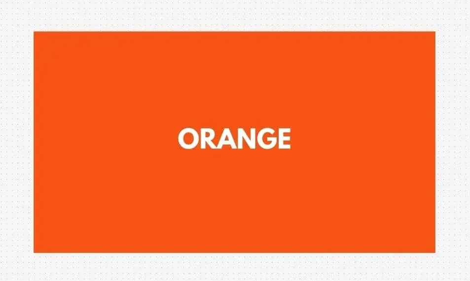
Orange (#f65314): Orange evokes a sense of energy and positivity. It is usually seen on prominent action buttons for quick actions, such as “buy now” or “ register”.
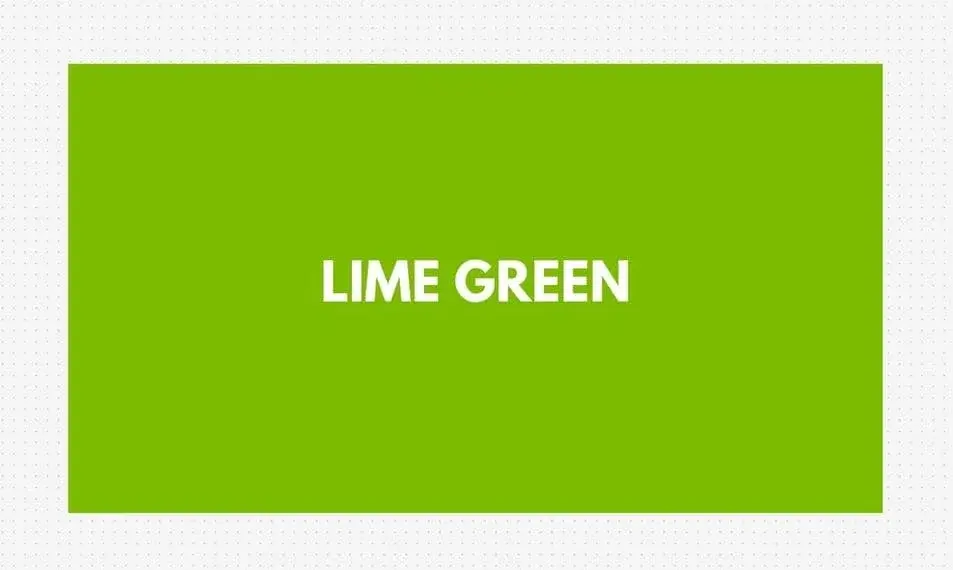
Lime Green (#7cbb00): This color symbolizes growth and new starts. Often used to install bars or to emphasize new features, it fosters creative thinking.
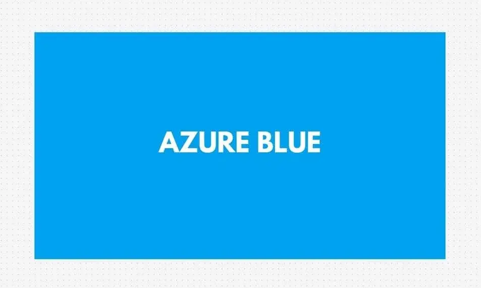
Azure Blue (#00a1f1): Azure represents reliability and business professionalism. Often used for program backgrounds, banners and menus, it inspires calmness and confidence.
Golden Yellow (#ffbb00): This hot yellow color evokes a feeling of warmth and positivity. It is commonly used to gently accentuate important key messages or notices.

Dark Gray (#737373): This dark gray color is used to off-set other colors. It preserves the clarity in text areas, borders and in passive sections.

These five colors deliver an inviting and user-friendly feel. Orange and lime green add vibrancy, while blue and dark gray provide balance and focus. Warm yellow highlights important details.
The Dynamic Role of Colors in Action
The Microsoft Color Palette isn't just for digital things – it's also used in real, physical items. Any marketing specialist worth their salt understands the power of color and incorporates this into their advertising campaign, whether through printed items like flyers, posters or merchandise.
Also, take a Windows 11 Pro PC, for example. If you buy a genuine Windows 11 Pro OEM key, it gives you an authentic and secure operating system. The appearance of the PC itself often presents the Microsoft Color Palette. The cool, dark gray case provides a plain foundation color and small blue accents might be visible on the keyboard or touchpad, imitating the soothing trustworthiness of the digital interface style.
Using the same colors for both physical items and digital products helps people recognize the brand quickly and gives a smooth experience.
Whether someone is using a gadget or surfing the web, seeing a familiar Microsoft Color Palette makes them feel guided and comfortable even without realizing it.
The Lasting Impact of the Microsoft Color Palette on Design
Microsoft Color Palette is more than just a collection of colors. It is a carefully designed palette that guides users without words, making them feel productive and comfortable in the digital world. While the five primary colors - orange, lime green, azure blue, golden yellow and dark gray - may seem harmonious, the true power of this palette lies in its flexibility.
Beyond the Screen
The influence of the Microsoft Color Palette is not limited to digital environments. The same colors are often used in physical products. Seeing soft blue tones on a sleek, dark gray laptop body helps users remember the brand and feel at home.
This harmony is reflected in Microsoft's other products, from hardware components like keyboards and mice to packaging and advertising. This consistent visual style reinforces brand identity and smooths the user experience, ensuring consistency across every touchpoint.
The Power of User Preference
While many people find the default Microsoft Colors pleasant and useful, some may want to add their own unique style. The biggest advantage of this palette is its flexibility. Users can create their own palette using a bright accent color, a soothing primary color, and a simple background.
For example, a designer might prefer a more vibrant primary color. Replacing azure blue with bright turquoise (#4285F4) boosts creativity while still maintaining a sense of confidence and professionalism. Similarly, someone who works with data may find that a cool, calm color like cerulean blue (#2A5CBD) is better for focus.
Collaboration and Inspiration
The Internet creates a large and vibrant creative community that is always experimenting with new user experiences. Online sites allow people to share their own color palettes inspired by the Microsoft tones. These different options offer many ideas for those looking to personalize their digital workspace.
Also, feedback on these custom colors can help to further improve the official Microsoft Color Palette in future updates. In this way, the palette is constantly evolving and adapting to users' wishes.